SmartSDR v4.2.18 | SmartSDR v4.2.18 Release Notes
SmartSDR v3.10.15 | SmartSDR v3.10.15 Release Notes
The latest 4O3A Genius Product Software:
The latest 4O3A Genius Product Software and Firmware
If you are needing assistance with FlexRadio products, please refer to the product documentation or check the Help Center for known solutions. Need technical support from FlexRadio? It's as simple as creating a HelpDesk ticket.
Notifications -- the BLUE button and clearing the unread status count.

In the Notifications the new items have a BLUE button next to them. If you hover over the button, a pop will say "Unread." If you CLICK the BLUE dot or the pop up, nothing happens.
QUESTION 1 - Is this clicking supposed to clear the BLUE button and drop the status count by one? If not what does it do? Reading the post does not seem to clear it either or am I missing a step?
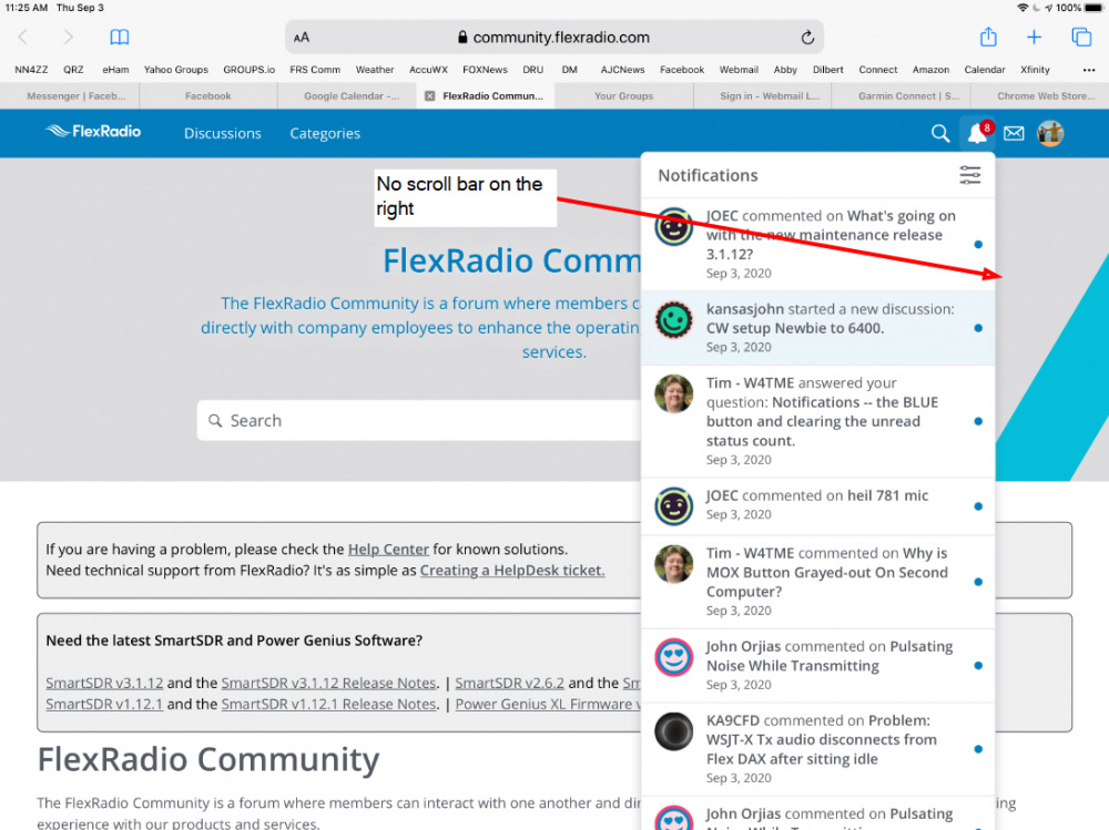
Currently to clear the status you scroll down to the bottom of the list to clear all of the BLUE buttons and reset the count to zero by clicking on "Mark All Read." On some mobile devices (e.g. iPad, phone) the list is NOT scroll-able. There does not appear to be any way to get to the bottom to clear the notifications.
QUESTION 2 - Can the "Mark All Read" button be move to the TOP of the list? That would solve the problem for mobile devices and also make it more convenient for PC user as well.
Regards, Al / NN4ZZ
al (at) nn4zz (dot) com
6700 Win10 SSDR V2.4.10
Best Answers
-
Al.
I have a 12.9" Gen-3 iPad Pro, using iOS v14.0.1
On the community website main screen, at the right, if I use finger to start vertical screen movement, a short vertical bar appears at far right screen edge. Press that bar with finger, changes it into a scroll bar. Works same whether usiing Safari or Firefox as browser. When vertical up or down screen movement stops, the bar disappears until you again move the screen with finger.
Dewey, WØYWW
5 -
Thanks, that works! On my iPad it is a bit touchy (pun intended) to trigger the scroll bar in the notifications popup but after playing with it, I can get it to work.
Regards Al / NN4ZZ
0 -
Dewey,
One more thought on the BLUE BUTTON. It would be nice if clicking on the button or clicking on the post to read it would just clear that one item in the list. That would be like the way FaceBook works. Then you could tell which posts you have read and which ones are still waiting to be read. You wouldn’t have to clear them all at once.
Do you see any way to do that?
Regards, Al / NN4ZZ
0
Answers
-
Here is a screen shot from my iPad, notice that there is no scroll bar to get to the bottom of the notifications to “Mark All Read.”
....Al / NN4ZZ
0 -
I think I've figured out the answer to Question 1 about the purpose of the Blue Dot. It looks like hovering over it is just intended to tell you that this post has not been read. And the pop up box is status rather than being an operation to change the status to mark it as read.
Question 2 is still unanswered. Repeated here:
Currently to clear the status you scroll down to the bottom of the list to clear all of the BLUE buttons and reset the count to zero by clicking on "Mark All Read." On some mobile devices (e.g. iPad, phone) the list is NOT scroll-able. See the iPad screen shot in the previous post. There does not appear to be any way to get to the bottom to clear the notifications.
QUESTION 2 - Can the "Mark All Read" button be move to the TOP of the list? That would solve the problem for mobile devices and also make it more convenient for PC user as well.
Regards, Al / NN4ZZ
al (at) nn4zz (dot) com
6700 Win10 SSDR V2.4.10
0 -
You said...
On some mobile devices (e.g. iPad, phone) the list is NOT scroll-able.
I do not see what you are talking about. It shows up on my iPhone, at the bottom.
0 -
Hi Tim,
The problem occurs when you have more notifications than will fit on the screen. The " Mark All Read" link is at the bottom but it is not visible or reachable. Notice that on the PC there is a scroll bar on the right. On my iPad there is no scroll bar. This snapshot is from Safari on my iPad but looks the same in Chrome on the iPad as well. It appears to be the way the community screen interacts with the browsers on the iPad.
Regards, Al / NN4ZZ
al (at) nn4zz (dot) com
6700 Win10 SSDR V2.4.10
1 -
Does anyone else see this issue when looking at the notification on an iPad?
It is only a problem if you have more notifications than will fit on the screen.
The " Mark All Read" link is at the bottom but it is not visible or reachable. On a PC there is a scroll bar on the right. On my iPad there is no scroll bar. This snapshot is from Safari on my iPad but looks the same in Chrome on the iPad as well. It appears to be the way the community screen interacts with the browsers on the iPad.
Regards, Al / NN4ZZ
al (at) nn4zz (dot) com
6700 Win10 SSDR V2.4.10
0 -
Have you had a chance to look at the iPad / MOBILE DEVICE view when there are more notifications than will fit on the screen?
On a related note, what controls the number of notifications shown? If there is a way to limit number shown, then the scroll bar would not be needed to see the bottom and clear them.
Regards, Al / NN4ZZ
0 -
I use an iPad for accessing this forum. When I select the bell it opens as it should. Reading the message does not clear it to as read. In order to clear unread/ read blue dot, on the iPad to get to the clear all button, one has to scroll to the bottom of the main page, then scroll the message list until the clear all is seen. This is rather cumbersome way of doing the clear function. Is there another way to clear read submissions?
0 -
Patrick,
-- Can you provide a screen shot of your iPad with the list of notifications?
-- Can you also note the iPad model and OS version?
-- Do you have a long list of notifications or is it short enough for all of them to appear on the main page without needing to scroll the list? See the post up above with my screen shot. On my Ipad Pro, the list of notifications is too long to display on the screen and there is no SCROLL BAR to allow me to scroll to the bottom to access the MARK ALL READ button.
Thanks...Al
0 -
Sorry for not answering sooner, was dealing with other non ham issues. But seems, that the problem was recognized and is now fixed. Can now scroll the notifications window without manipulating the main window up or down to make the notifications window function. Thanks Flex and service provider.....
0
Categories
- All Categories
- 393 Community Topics
- 2.2K New Ideas
- 669 The Flea Market
- 8.5K Software
- 174 SmartSDR+
- 6.5K SmartSDR for Windows
- 191 SmartSDR for Maestro and M models
- 450 SmartSDR for Mac
- 276 SmartSDR for iOS
- 266 SmartSDR CAT
- 215 DAX
- 389 SmartSDR API
- 9.5K Radios and Accessories
- 73 Aurora
- 317 FLEX-8000 Signature Series
- 7.2K FLEX-6000 Signature Series
- 981 Maestro
- 58 FlexControl
- 869 FLEX Series (Legacy) Radios
- 952 Genius Products
- 474 Power Genius XL Amplifier
- 349 Tuner Genius XL
- 129 Antenna Genius
- 311 Shack Infrastructure
- 217 Networking
- 474 Remote Operation (SmartLink)
- 143 Contesting
- 833 Peripherals & Station Integration
- 146 Amateur Radio Interests
- 1.1K Third-Party Software


